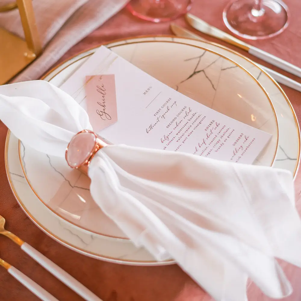
Embrace Sailorcore and still have an event that looks and feels personal.
If you have been watching the runways, the yacht clubs, or even your own Pinterest board lately, you have likely noticed that the stripe is back. The sailorcore movement has moved well beyond fashion week, and we are seeing it translate beautifully into the most elevated event design of the season. While we are here for this classic, timeless trend, what we are not fans of are the number of times we see events that have the same navy stripe, the same brass tapers and wicker chargers.
We would love to share inspiration from some of our favorite planners and florists. Some stay true to the trend’s roots, working in the natural tans, whites, and crisp blues that give sailorcore its signature ease. Others reimagine it entirely, bringing in non-traditional colors like pink and green and layering prints that run from light and playful to striking and bold.
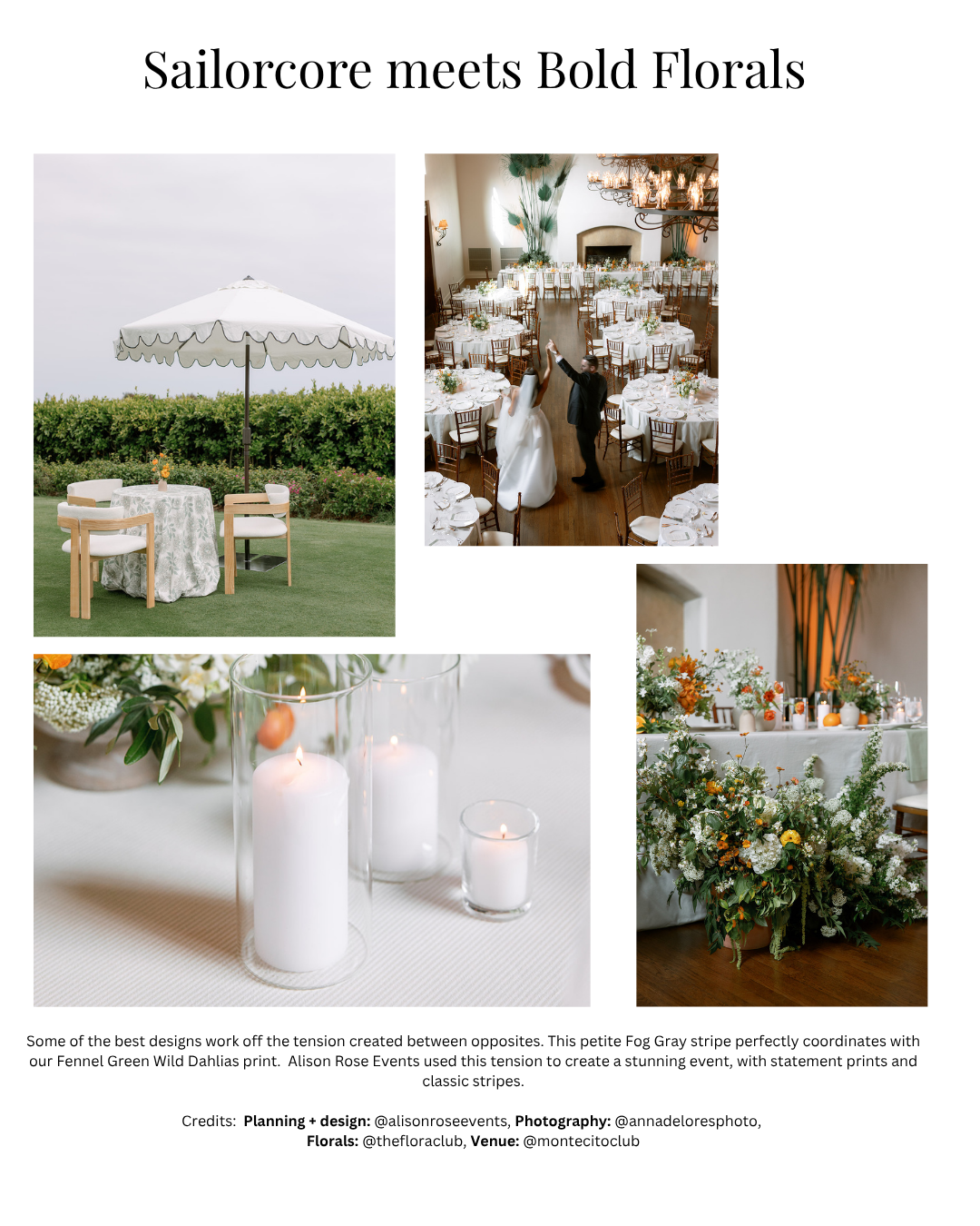
Bold Florals
Some of the best event design works off tension rather than harmony. The pairing of a classic sailorcore stripe with an unexpected, nature-forward print is a perfect example. Here, planner Alison Rose Events used our petite Fog Gray stripe alongside our Fennel Green Wild Dahlias print to create a table that feels simultaneously grounded and alive. The stripe brings the structure and restraint that sailorcore is known for. The bold floral print answers it with movement and color. Neither element overwhelms the other, and the result is an event that reads as current without reading as copied.
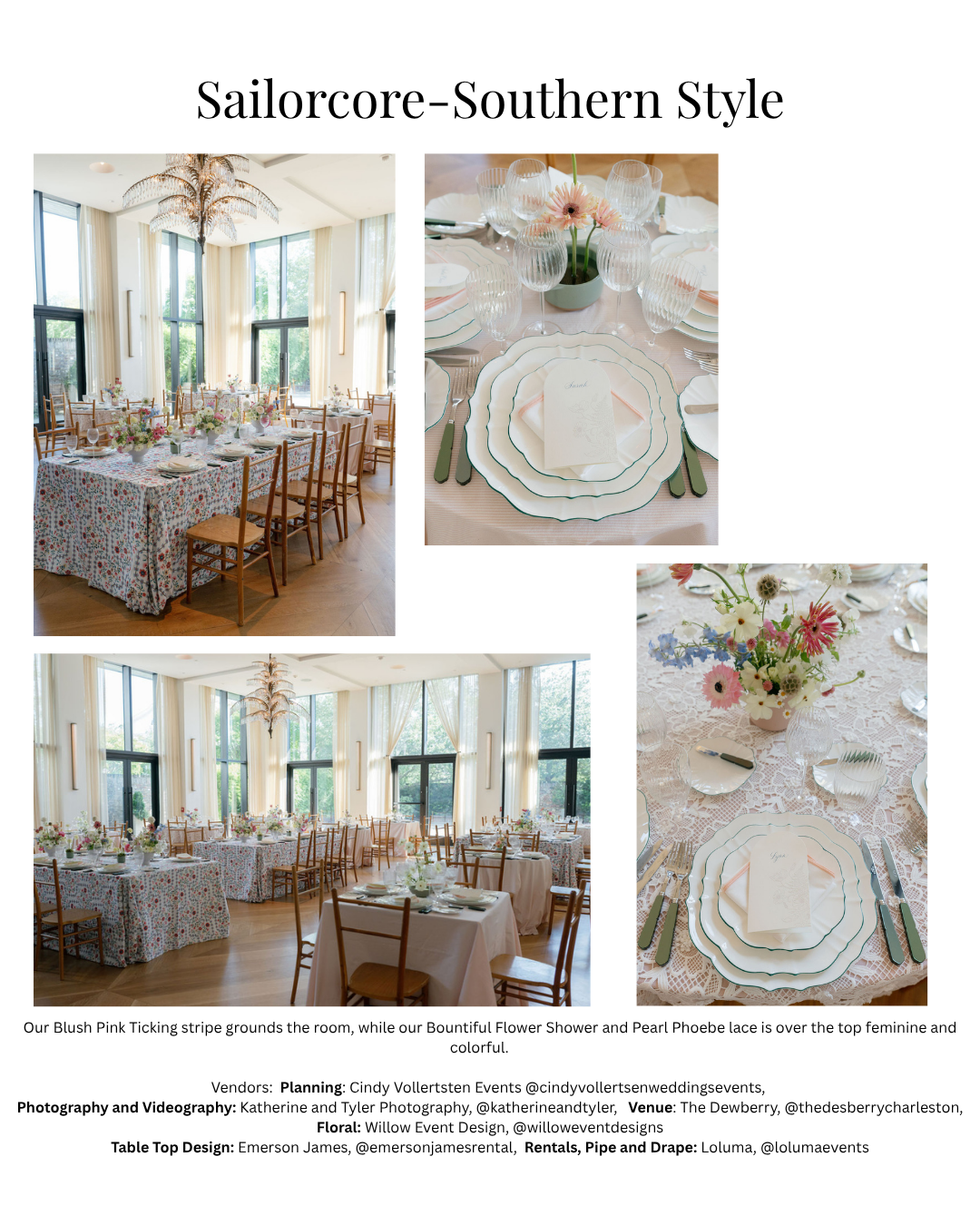
Southern Style
Not every interpretation of sailorcore starts with a stripe. Sometimes the connection is more instinctive, a shared sensibility of softness, pattern, and an ease that feels inherited rather than assembled. This event, held at The Dewberry in Charleston and designed by Cindy Vollertsen Events, makes that case beautifully.
The foundation here is our Blush Pink Ticking stripe, which anchors the room with just enough structure to hold everything else together. Layered over it, the Bountiful Flower Shower print brings an exuberance that feels entirely Southern, the kind of floral that belongs at a garden party that has been planned for a year and looks like it came together in an afternoon. The Pearl Phoebe lace adds a third texture, sheer and delicate, that keeps the femininity from tipping into anything overly precious.
What makes this table work is that none of the three pieces are fighting for attention. The ticking stripe recedes just enough to let the floral print lead. The lace softens the edges. The scalloped green-rimmed chargers and the loose, wildflower-style arrangements from Willow Event Design bring color and movement without competing with the linens. The result is a table that is unmistakably of-the-moment and unmistakably its own thing.
This is what sailorcore looks like when the South gets hold of it.
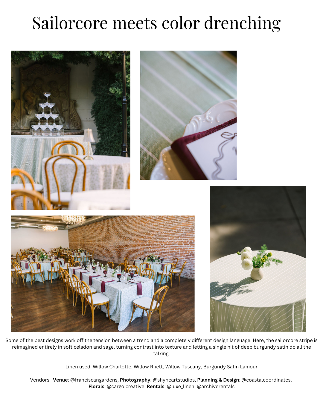
Color Drenching
Color drenching, the practice of committing to a single tone across every surface of a table, is one of the other major design conversations happening in 2026. What this event demonstrates is what happens when you let two trends find each other.
The stripe is present here, but it is not doing what you expect. Rather than the crisp contrast of navy against white, the Willow Charlotte, Willow Rhett, and Willow Tuscany linens work within the same soft family of celadon and sage, so the stripe becomes about texture rather than color. The table reads as quietly layered rather than graphic, and that restraint is precisely what makes it feel elevated. The room does its part as well. Warm exposed brick and honey-toned wood floors push back against all that cool softness in a way that feels entirely intentional, the kind of contrast that belongs in a beautifully designed restaurant as much as a wedding reception.
Then the burgundy Burgundy Satin Lamour napkins arrive and the whole table snaps into focus. One deliberate accent, placed with confidence, against a field of tonal calm. It is a lesson in knowing exactly when to stop adding things.
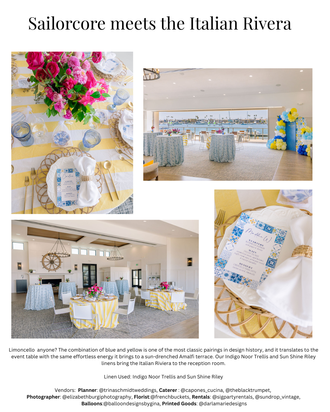
Sailorcore Meets the Italian Riviera
If sailorcore has a spiritual home outside of New England, it is somewhere along the Amalfi Coast, where blue and yellow have been a way of life for centuries. This event understands that completely.
The Sunshine Riley linen brings a bold, warm stripe to the table in a yellow that reads as sunshine rather than caution, the kind of color that belongs on a terrace overlooking the water with a limoncello in hand. Against it, the Indigo Noor Trellis introduces the blue side of the conversation in a print that references Mediterranean tile work, which is exactly the right cultural note for this direction. The two linens should not work as well together as they do, and that is precisely what makes the table memorable.
The rest of the design follows the logic of the linens rather than fighting it. Hot pink florals from French Buckets land as the third color in a palette that could have stayed safe and instead chose joy. Gold flatware and rattan chargers bring warmth and texture. The blue glassware ties the trellis print back to the place settings so the whole table reads as considered rather than collected.
Planned by Trina Schmidt Weddings and photographed by Elizabeth Burgi Photography, this event is what happens when a design team trusts the palette completely and commits without apology. The result feels like a celebration that could only have happened exactly this way, which is the highest compliment a table can receive.
Your Event, Your Way
Sailorcore is a starting point, not a prescription. Whether you are drawn to the classic navy and white, a tonal celadon table that whispers the stripe rather than announcing it, a garden-party floral layered over a ticking base, or a sun-drenched yellow and blue combination that belongs on the Amalfi Coast, the thread connecting all of it is the same: a stripe paired with intention. At Luxe Linen, we have built our inventory specifically so that the combinations are as individual as the events we dress. We would love to help you find yours. Reach out to our studio to schedule a consultation, request samples, or simply start a conversation about what your table could look like. We are here for all of it.